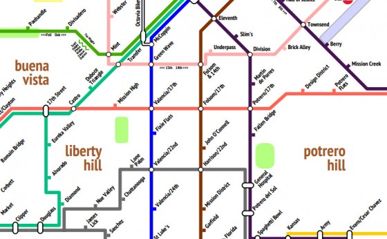
Even though the SF bike coalition has put a ton of painstaking work into creating a thoroughly-detailed bicycle map of the city, it can appear pretty daunting to anyone glancing at it while trying to plan a riding route, and just plain overwhelming to newbie riders looking to adopt cycling as their primary means of transportation. Fortunately, longtime cyclist Mat Kladney noticed this and decided to create a map that makes bicycling from one end of the city to the other look as simple as following a straight line:
“Need to get from Downtown to the Bernal Heights? Just follow the Blue Line,” he says. “This simplicity will re-frame the existing San Francisco bicycle lanes as the San Francisco Bicycle System and will help convince more people to saddle up and take to the streets.”
Instead of contoured lines denoting hill grade or the inclusion of every single city street, the map ends up looking like a subway system map, with popular routes like Valencia’s “Green Wave” called out. So, the next time you’re trying to figure out the perfect route to that bike picnic at Baker Beach, just pick a color or two a ride!
[Link to map, via The Atlantic]

Kladney’s map presents an over-simplified view of a cyclist’s choice in routing through SF. See the detail of the Rufus Graphics designed SF Bike Coalition map (that the article critiques as “cluttered”) here: http://www.rufusguides.com/assets/details/sfbikeD.png )
Yes, oversimplification was the point…
• Love the Rufus Graphics map, and I lobbied to have those contours added. I daresay they would improve the simplified map without really hurting its simplicity.
I think @Choices in Bike Routing missed the entire point of this clever useful map. Both maps would be useful to a Sunday bike rider like me. I can plot out my route on the Rufus map at home and bring the Kladney map with me.
I like how he’s got the Lone Palm on there.
Came here to post this
Cool looking map, so much work in there!
In this pdf format, it takes a very long time to draw, so it’s less useful than it could be. It’s confusing that it mixes so many items on the routes with the same formatting– streets, locations, neighborhoods, all just hanging out on the lines.
excellent map and much easier to follow than the all the other convoluted ones out there.
thanks!
People are supposed to just power up 17th to Clayton, huh?
lazy people can you this visual pleasant but completely useless map, I will stick to the good old sf bike map that paths, hills and actual street names. have fun you public bike fasionistas!
looks great but remind the bikers of the stop signs and red lights. Thank you