![]()
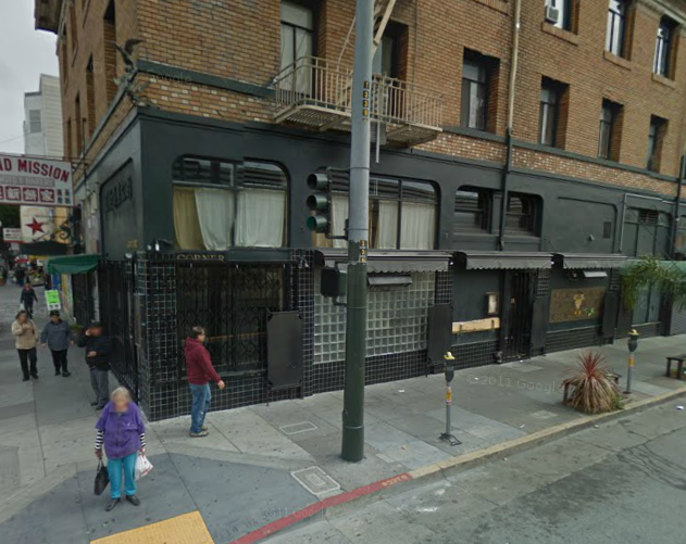
Brand New, the world’s best branding blog, today veers away from big global and national brands and takes a look at a little ol’ restaurant that started out in the Mission:
The previous logo, apart from being almost a non-logo, was somewhat confusing, highlighting “ED” above anything else and the old menus didn’t quite make justice to the $11-cocktails or $50-plus-wine bottles available. The new logo is an elegant, Lubalin-esque solution that, if not entirely perfect — the tracking feels a little tight and I wish the diagonal line connected in a smoother way with the “THE” on top — conveys a better sense of upscale dining and the uniqueness of the restaurant.
Read on to see how the new logo is applied to menus and and other stuff.


. High on Gold reports: The group will be presenting a special, one-night only installation to coincide with their tour stop in San Francisco in support of their newest LP, TEN$ION. In addition to the installation, Die […]</p>
%5Bvia+%3Ca+href%3D%22http%3A%2F%2Fwww.missionmission.org%2F2012%2F02%2F22%2Fdie-antwoord-will-be-hanging-in-the-lower-haight-this-afternoon%2F%22%3EMission+Mission%3C%2Fa%3E%5D&clickthru=http%3A%2F%2Fwww.missionmission.org%2F2012%2F02%2F22%2Fdie-antwoord-will-be-hanging-in-the-lower-haight-this-afternoon%2F)
 through the weekend. Fresh & Onlys play there tonight, Thao and John Vanderslice tomorrow and Bob Mould Friday.</p>
%5Bvia+%3Ca+href%3D%22http%3A%2F%2Fwww.missionmission.org%2F2012%2F02%2F22%2Fbottom-of-the-hill-has-a-fireplace-now%2F%22%3EMission+Mission%3C%2Fa%3E%5D&clickthru=http%3A%2F%2Fwww.missionmission.org%2F2012%2F02%2F22%2Fbottom-of-the-hill-has-a-fireplace-now%2F)