In case you missed it, yesterday we debuted a new look. (It was promptly panned by critics, so we took it down.) (Also, the Buca di Beppo ad was totally an April Fools, we swear.)
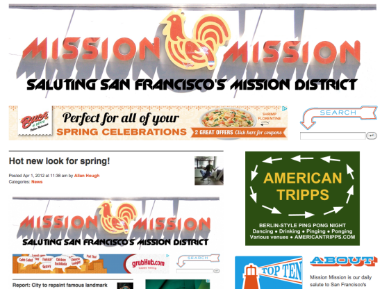
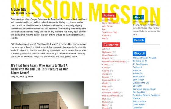
But seriously, that new header is something I was working on back in 2009, before the boys from Sleepover swooped in and designed the Mission Mission we all know and love currently. (Which is why it’s missing the mural that surrounds the Mission Market signage today.)
Anyway, in digging up this old thing, I came across a whole mess of other iterations of Mission Mission’s look, including a few what-might-have-beens. Firstly, this is basically what it looked like in the beginning:
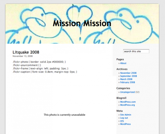
Nobody will remember that because I was probably the only one that read it during that look. After about a year, I switched to a different, more sophisticated WordPress theme, and also made a somewhat more sophisticated header:
Which lasted for way too long, according to most. After six months or so of that, I started toying with some new ideas, including the Mission Market thing above, and this:
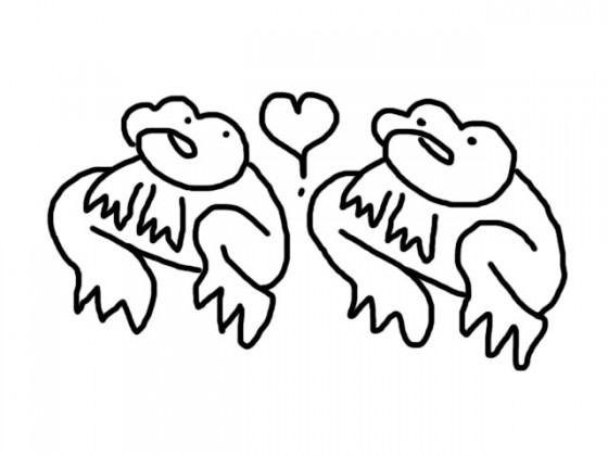
I was going for newspapery I guess. Here’s an interesting version of the Ribity stamp from when I was trying (and failing) to get it just right:
At some point we had an official seal too:
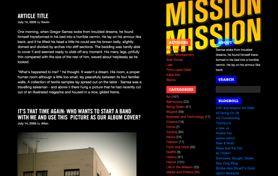
Finally, Tag Savage and David Cole of Sleepover SF came to our rescue. Before we settled on the current design, there were a couple other drafts:
This gorgeous piece of work (by Tag) lives on in our sidebar:
And here’s something weird that happened in Photoshop once, because I am not very good at Photoshop:
Thanks for reading, everybody!





Hey missionmission, why don’t you do some reporting on how the govt. is crushing pot dispensaries in the city.
Why don’t you shut up, you gross hippie.
<3
+1, up vote, like, retweet, <3 <3 <3
This is really what counts as funny around here?
Around here kinda sucks, yo. Don’t take it personally.
http://gifparty.tumblr.com/post/74751059
I always liked the Ribbitys best…
what does it look like now?
NavelgazingNavelgazing